
User Interface Design
Stock Market Analysis App
GOAL: Design a user-friendly stock analysis product for a Taiwan-based investment firm, featuring real-time updates, customizable watchlists, and easy-to-understand visualization of analysis through charts and infographics. The product aims to provide personalized insights and enhance the user experience through visual elements such as illustrations.
Design
Design:
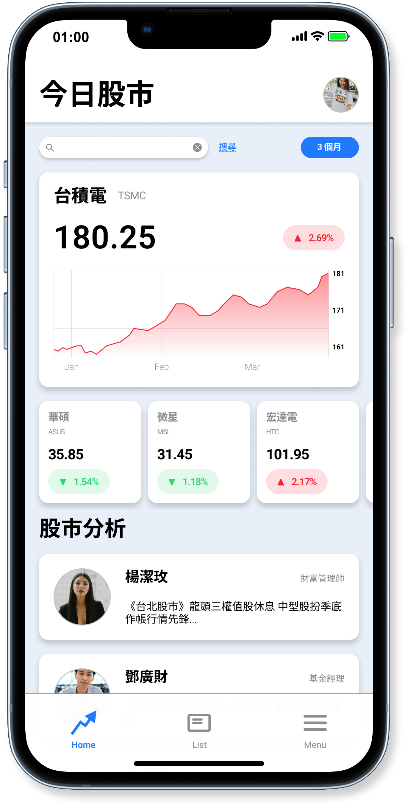
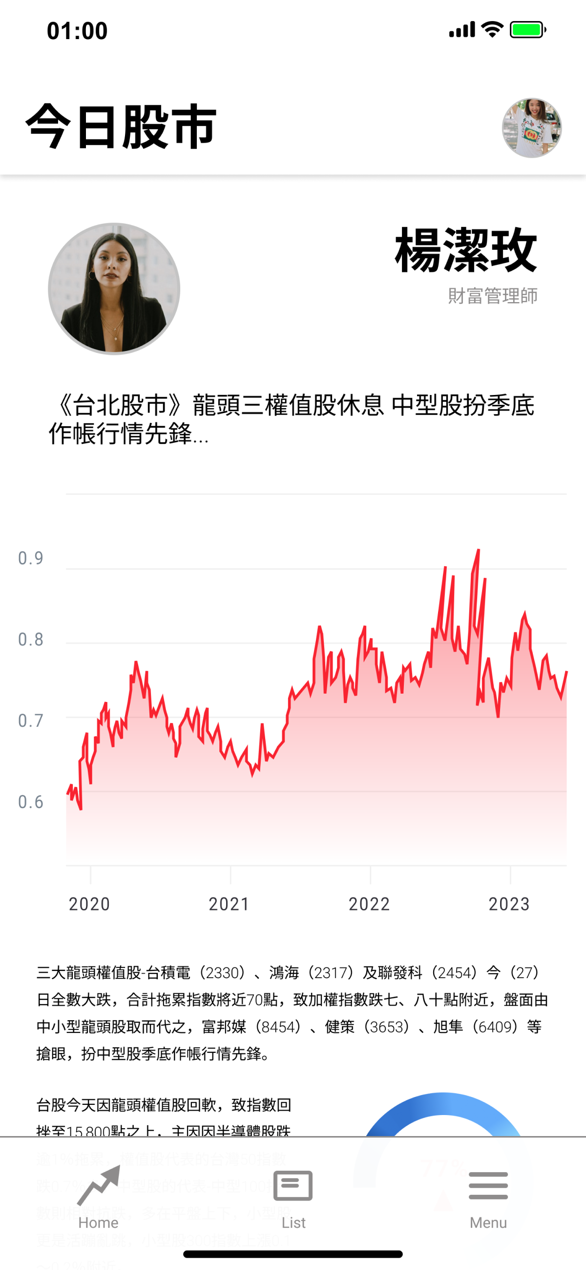
The stock market analysis product is designed for a Taiwan-based investment company, allowing users to view real-time market trends and customize their watchlists for both stocks and analysts. The product prioritizes data visualization to enhance users' understanding of complex financial data and analysis. It's worth noting that the Taiwan stock market convention uses red to indicate an increase in value and green to indicate a decrease, which differs from the convention used in the US market. This is a deliberate design choice of localization.
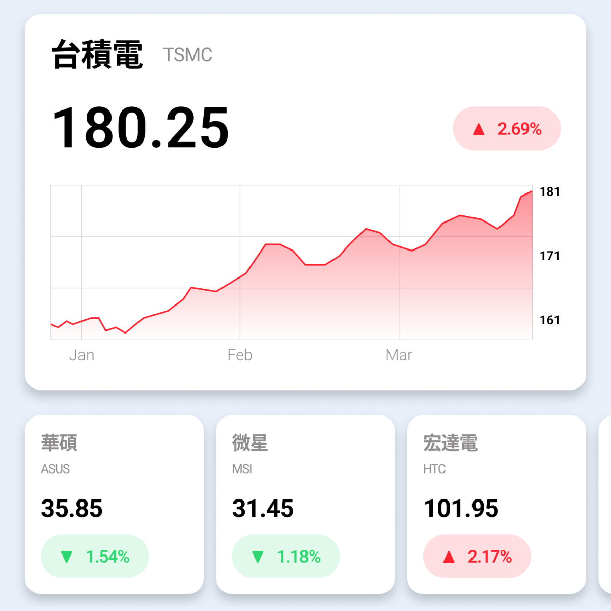
Dashboard:
The centerpiece of the product's homepage is a clear and easy-to-understand stock market graph, which enables users to quickly understand the rise and fall of the stocks. Below the large chart, there is a horizontal row of customizable small charts that allow users to track their preferred stocks. Each small chart displays the current price of the stock and the percentage change in color. This intuitive layout provides users with a clear understanding of the stock market at a glance, even without a line chart.

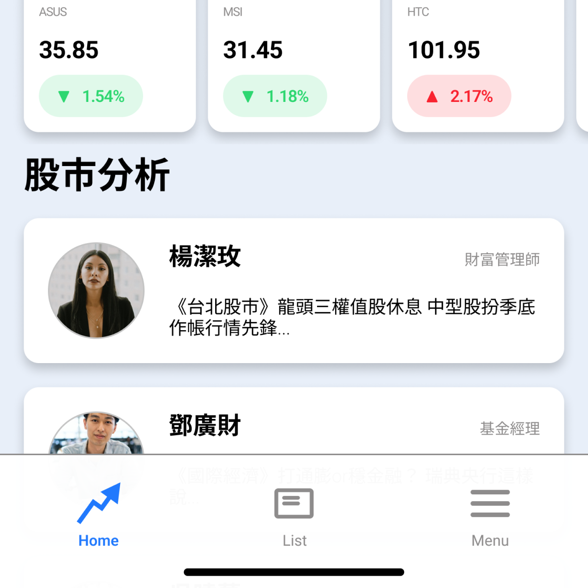
Analysts List:
The homepage also features a list of analysts in the middle section, which allows users to easily follow their preferred analysts and read their real-time stock analysis. Before entering the desired analyst's page, users can see the propositions or main titles analyzed by each analyst on that day. This design not only provides users with the latest insights from industry experts but also allows them to customize their information sources according to their preferences. By providing an intuitive layout and clear visual hierarchy, users can quickly locate and access the information they need.
Bottom Nav Bar:
Our Bottom Nav Bar design is intentionally simple, with just three icons for the most important functions: Home, List (showing the stock prices of companies users are tracking), and Menu. This minimalistic approach ensures users can quickly and easily access the features they need without any distractions. To provide a clear indication of the user's current location, the icon will turn blue when they are on that specific page, and remain grey for all other pages. This intuitive design aims to enhance the user experience and ensure users can navigate our app with ease.

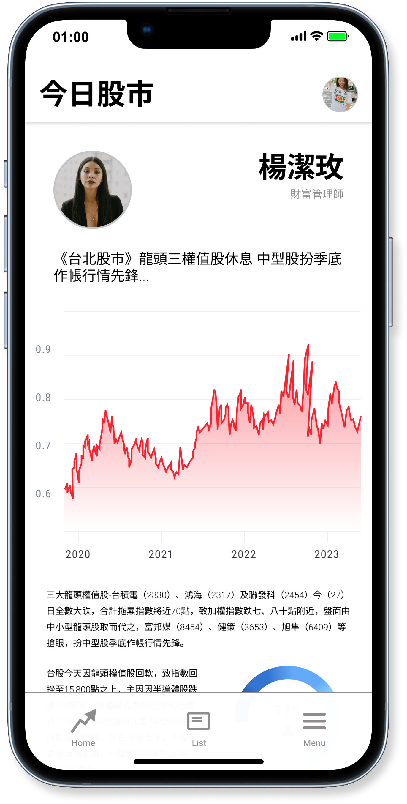
Analysis Page:
Once users click on their preferred analysts, they will be taken to the corresponding analysis page, where they can find the analyst's main analysis with various visualizations. This feature not only facilitates the comprehension of complex data but also provides a more engaging and informative experience for users. By utilizing visual aids such as charts, graphs, and diagrams, users can easily identify trends, patterns, and key insights, which enhances their understanding of the stock market. Our aim is to create a platform that empowers users with valuable information presented in a clear and visually appealing manner.